A story of Trafik
TradeSpotting has entrusted the Lyon agency Trafik with the overhaul of its graphic identity for full deployment. Singularity, universality and humility have been the watchwords for the construction of a design that is at the same time strong, playful and surprising!
Trafik, a graphic design agency ?
Yes, but not just graphic design… Joel Rodière and I founded this office on our two professions. Joel and dev and I am a graphic designer. It was therefore a matter of working together and imagining projects that combine our skills.
How do you see the design of a graphic identity for a brand? – Graphic design: an approach that is both digital and print ?
Indeed, the question of digital and print no longer arises. An identity must work with full deployment. Print, desktop, mobile, static, animated. It involves more important work but also more interesting. For us, an identity should not only be coherent and timeless, it can also be playful, surprising, even fun …
How did you think about the conception of the identity and the new image of TradeSpotting ?
The agency totally dedicated to digital. The challenge has been to offer a global identity that emphasizes “human” values to remind us that behind all his knowledge there are people and sensibilities.
In addition, the agency being in full development (international), we have also developed a principle which evokes “universality”. Which is not easy because universality can lead to disembodied principles …
What is the graphic universe conveyed through the new identity ?
Singularity, universality and humility.
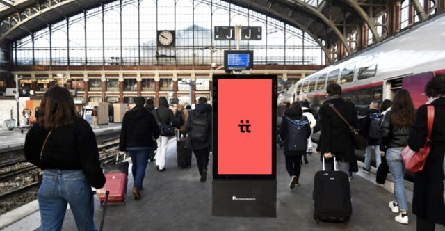
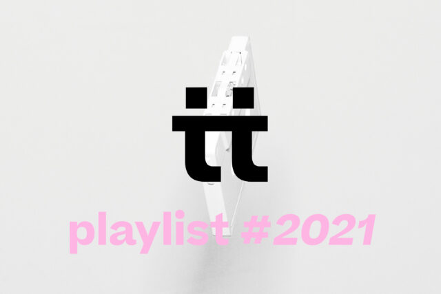
Regarding the logo, we looked for a graphic symbol that evokes meeting, connection, data and development. So we played with the 2 tt that we redesigned to evoke these values.
Then, a “strong” typo choice which helps identify the agency beyond its logo. Then a range of very playful and uninhibited colors, allowing dynamic and explosive chords to be played. Finally, we mix it all up with a few images to create unexpected encounters. A pleasure to coordinate and deploy.
The web and print approach at the heart of the reflection ?
Totally, desktop and mobile first. And all the tools so that the team can appropriate the language as part of its recommendations.
Eternal question, what are the sources of inspiration?
François Morelet for his principles of constraints, Sol Lewitt for his graphics and many kinetic artists, Vasareli, Sotto, Julio Leparc …
Does the Trafik agency have its own aestheticism ?
Not necessarily, what matters to us is to be fair and to find the shapes that make sense.
Can you share with us some graphic projects that have marked you ?
Jean Widmer for his work for the CCI, the identity of the George Pompidou center or for the pictograms for the SAPPR highways (which we no longer see). John Maeda for his calendars for the Shisheido brand and his code-based graphic productions and also Paul Rand to whom he owes some immortal logos like IBM, UPS (old version), and also Saul Bass his generic very graphic stuff.
Upcoming projects ?
We have just delivered a big exhibition on the “critical” spirit for Univescience, we also deliver the communication of a few National stages and always a lot of competitions for subjects of identity and scenography.
In short, no time to be bored and it looks good on us.
Pierre Rodière
Agence Trafik